How to design a workshop slide deck

We’ve probably all sat through classes, lectures, workshops, and courses where we’ve encountered Death by Powerpoint.
Cluttered slides. Cliched stock imagery. No narrative. Monotone delivery.
Just the mention of its name can send chills down the spine. Perhaps the colour drains from your face at the prospect of experiencing it.
However, it doesn’t have to be this way.
And with workshops, it definitely doesn’t have to be this way.
When running a workshop, you don’t necessarily need slides (especially if it’s a craft-focused session like a workshop on making ceramic pots), but it’s always helpful to know what makes for a good slide deck.
Slides, when done well, can be a hugely valuable asset to a workshop, especially when every workshop session (at the time of writing) is running remotely.
Start bad
To help understand what makes for a good slide deck, a good place to start is avoiding what makes one bad.
Here are 5 common missteps when creating slide presentation decks for workshops.
These all sound simple, but they’re very easy traps to fall into (I have, occasionally still do). However, if we know the trap is there, we probably have a better chance of avoiding it 🙂
Note: The tips in this guide are particularly focused on workshops, but also apply to just about any slide deck design.
Here we go….
1. The 2 slide prompt
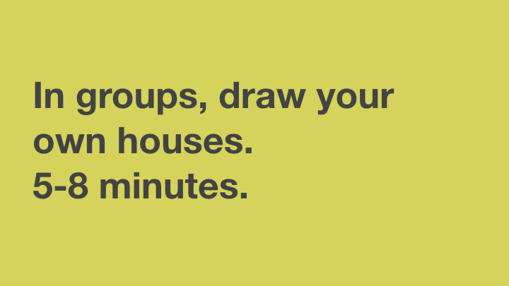
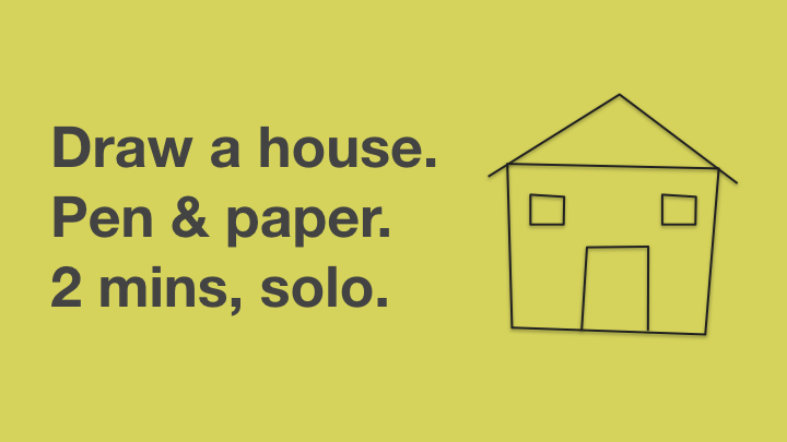
Let’s say we’re setting up the group for an activity.
We can explain it verbally, but having a visual aid of some kind is very helpful (especially as we’re inclusive Workshop Creators). We may use handouts for this, or the chat function on video, but most likely we’ll use a slide, especially for a more involved activity.
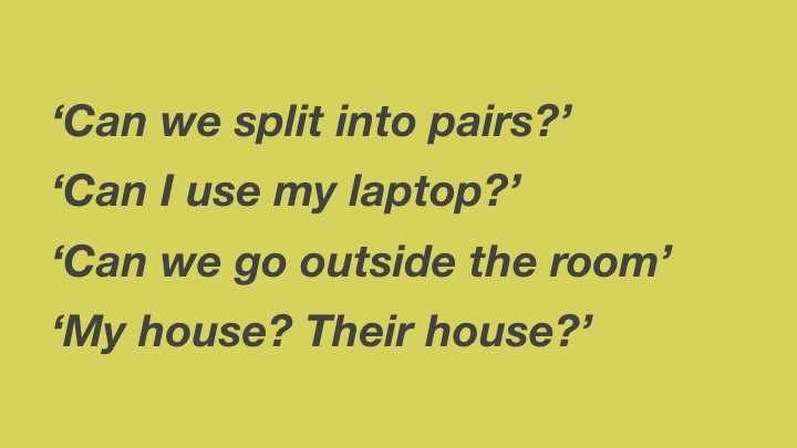
One of the two factors that damage activities most is unclear communication. Unclear communication opens us up for questions, confusion, frustration, wasted time, and serious dips in trust and energy. Bad news.
Instructions on two (or more?!) slides is a surefire way of putting us in this uncomfortable position. We end up hopping back and forth, different groups want to see different information, and it’s hard to process and absorb.
We absolutely want to keep our instructions to one slide.
This is even more important for more complex activities, which is indeed counter-intuitive. We have to make the complex…simple. If we can’t get simple enough, it’s a good indicator we probably need to head back into the lab to revisit our activity and chunk it down.
Want to know more about activity design? (opens in a new tab)”>Join one of our workshop creation sessions >
2. Disconnected images
Another bit of dissonance comes with disconnected images. I love using images on my slides – especially full-bleed, perhaps with a dark tint over the top so they’re not too distracting from the main conversation (as my friend Andre says, we should treat the slides as backing dancers).
However, it’s important to think through image selection carefully.
There are the obvious things like pixelation, but beyond that are considerations such appropriateness for the audience, cultural references that may not land, and mixing metaphors.
At the more serious end of the scale, we can end up humiliated that we’ve offended a group with an image that they may find offensive or taboo in their culture.

Yet even a less serious problem can cost us: I still cringe at trying to explain the meaning behind the use of a GIF featuring a little-known British football manager as a way to convey the importance of thinking for the long haul. It cost time, trust, and energy.
3. Overestimating absorption
You may have heard of the concept 7±2. Simply put, the theory behind it is adults can generally only stores 7 pieces of information in their short-term memory at a time, plus or minus 2 (i.e. between 5 and 9).
A good example of this is in sports – rugby teams have 15 players but they’re split into groups of forwards and backs so we can easily make sense of the information and formation of the team.
We can see how this shows up in slide design through this example:

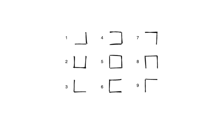
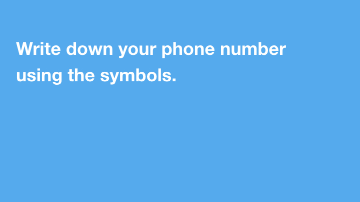
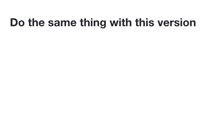
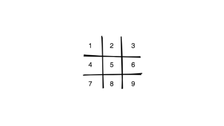
While we may not always be asking our attendees to parse their phone number through a form of basic hieroglyphics, keeping information bitesize (and with clearly understandable and recognisable patterns) will serve us well: just a few points on a slide; a handful of concepts before switching workshop teaching formats.
4. No agenda
Even the most adventurous of adult learners will probably want to know what’s coming next. Adults want to know what they’re going to be learning – the ‘why’ and the ‘how’.
Related: here’s a handy list of thinking about preparing an adult learning session
The simplest and most effective way to help people see what’s expected of them is the small but mighty agenda slide.
This need not be complex; two bullet points plus the all-important break time is enough.
Pro tip: Don’t include exact timings on your agenda – it’s an unnecessary albatross, and no good workshop should run exactly to time 🙂
5. Use Words
Sometimes I’ll retreat in tricky situations or when I’m rundown, confused or tired. To pull me out of my hypnosis-esque fugue, my wife will utter the phrase ‘Use Words’. I need to say what I need, and say what I mean.
In workshops, we don’t our audience to feel tired, rundown or confused. We don’t want them to feel that this is an uncomfortable place to be.
We need to use words. We do this primarily through our facilitation skills, but we can also do it through our slides.
Of course, a common cause of Death by Powerpoint is through verbosity – long essays slapped onto a slide-shaped postage stamp.
We don’t want this. However, text can also really help us out.
I’ve seen several wonderfully designed presentations go smoothly and then suddenly, as the presenter moves from one slide to the next there’s…nothing.
The primal fear of mind going blank. It’s the other side of the disconnected image problem.
What does this image represent?
Where in the story does it fit?
What was the point we were trying to explain?
I’ve seen lots of people try and go minimal, using hardly any text at all and then have to remember the entire deck from scratch. This creates the fear and panic, which is not good for the Workshop Creator.
In the words of The Streets
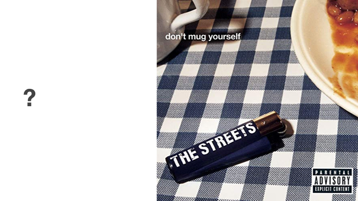

Don’t mug yourself.
Use words.
That’s a quick 5 on avoiding the traps in workshop slide design.
Want to learn more? Join our tribe of workshop creators – over the coming weeks we’re running free express workshop design sessions, a 6-week design & facilitation cohort, and launching a membership club to help creators from around the world stay connected and build their workshop superpowers.